Help users complete a single task
This page explains how to help users complete a single task using:
- information page template
- inline index template
When to use these templates
Use these templates to:
- help users start a transactional service or task (for example, where your page includes a 'start' button)
- help users complete a series of steps in a single task
Help people start a transactional service or task
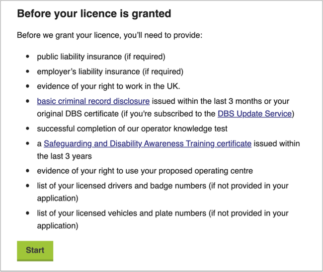
Use the information page template if you are:
- giving users information to start a single service (for example, applying for a private hire licence)
- including all the information they need before they start the task
- linking out to a form where users can complete the task
Read more about how to use the information page template

Help people understand a series of steps in a single task
Use this the inline index template to explain steps in a single task. This template works when users do not need to complete steps in a specific order. They may want to read all the information before deciding what to do next.

Make sure you give the user all the information they need to be able to complete the task. This might include:
- who should complete this task
- when they need to complete the task
- any other tasks they must do before completing this task
- where they can get help
When not to use the inline index
Use the step by step template when:
- users need to complete steps in a logical or specific order
- users need to complete a series of tasks
In the step by step template, the information page for each 'step' sits on a separate page. There is not a consistent index connecting each page in the step by step as users may need to complete several different tasks in a step at different times.
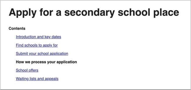
In the inline index, all pages within the task are clearly connected by an index which appears at the top of each page. This is useful when steps within a single task can be easily grouped together.
The inline index might not be suitable for multiple, separate tasks that some users need to do and some don’t. You may need to separate these into smaller user stories or use an information page and contents panel to help users skip to the information or task that is relevant to them.
How inline index works
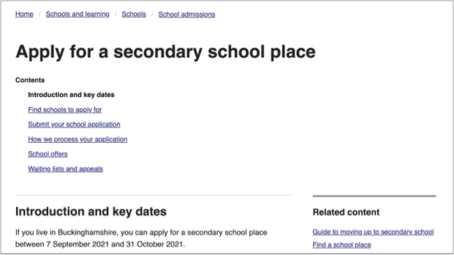
The inline index template breaks down a task into several steps. It uses a linked index at the top of the page to help users understand the steps they need to complete.
Each index heading is linked to a child page within the task.

Break your task into steps
Think about how your users might approach the task. They may not need to complete all the steps in the task. They may complete tasks in different ways.
Example
Parent A wants to apply for a primary school place for their first child. The process is new to them. They may need help to understand how to apply or to find the right school. Parent A needs to understand all the steps in the task.
Parent B wants to send their third child to the same school as the child's siblings. Parent B has applied before and knows which school they want to apply to. Parent B can go straight to submitting their application without reading the other steps.
Each step will appear on a separate page. The index appears at the top of every child page so that users can navigate between each step within the task. A step might include:
- information the user needs to complete task (such as timescales, deadlines, fees or eligibility criteria)
- links to information that could help them understand the task (such as policies and guidance)
- links to other tools or services that will help them complete the task (such as an eligibility checker, a postcode look up for their nearest service or a set of rules they need to read before starting the task)
Your steps should reflect user needs you’ve identified through research.
Buttons at the bottom of each page help the user to move back and forth between steps.

Titles
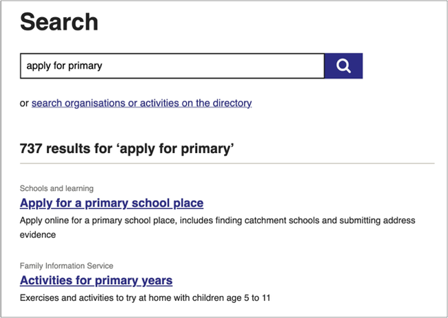
Every page in an inline index can appear as an individual search result or in a navigation menu alongside other titles. It needs to make sense regardless of where the user sees it. For example, "Apply" does not say much but "Apply for a secondary school place" does.
Make sure your titles are clear and describe what the page about. This will:
- help users find the page
- help users decide if the information is relevant to them
Use active words that describe the task. Avoid unnecessary introductory words.
Example titles
Good example: Apply for a secondary school place
Bad example: Information and guidance about how to apply for a secondary school place
Listing summaries
Use the listing summary to help users find your page in a search. The listing summary should clearly describe what the page helps the user to do. You can edit the listing summary in the 'promote' tab in Wagtail.
Example page title: Apply for a primary school place
Example listing summary: Apply online for a primary school place, includes finding catchment schools and submitting address evidence

Help and support
Contact the webteam via ServiceNow if you need to:
- ask a question
- get help to choose a template
- get help with writing content
- make a suggestion for something we need to include in this guidance
You can find more guidance on writing content in the content design resources in the GOV.UK Service Manual.