How we share or explain policy, strategy or terms and conditions
Long form content template (policy, strategy and brochures)
When to use this template
Use this template to when you are writing new policy, strategy, brochures or terms and conditions. Read this guidance before you start drafting your document as it will help you structure the content in a way that helps people to read it online.
This template is similar to the long form content (guidance) template. Always use the the word 'Policy' or 'Guidance' in the page title to help users understand what they are reading.
The language of policy can be complex, jargon-heavy and non-specific. This makes these documents confusing, hard for non-experts to understand and open to misinterpretation. By publishing policy information that is simple and easier to read we can:
- make it easier for people to comply with rules, regulations and laws
- make it easier for our staff to do their jobs
- deliver better services
- improve the way the council communicates, both internally and externally
- encourage participation in local democracy
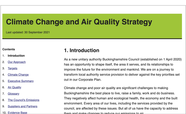
Example
When not to use this template
This page may not be suitable when:
- you want users to complete a single task
- you want users to complete a series of tasks in a specific order
- you are addressing a single user need
- your content is not all related to the same policy area
How it works
This template uses side bar navigation to help users find the information they need. You can turn on chapter numbering where you have specific policy statements.
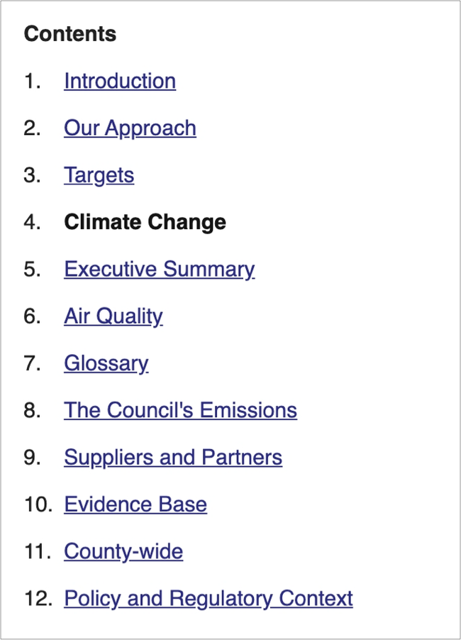
Break up your content into sections. Order your sections in way that will be helpful for users who are reading online. This might not be the same order that sections appear in a printed document.
Each section header will bring up a new page. The sidebar navigation appears on the left of every page so that users can navigate between different sections or miss them out altogether.
Buttons at the bottom of the page help users navigate back and forth through the content in the order you’ve set out. They can also choose to navigate using the sidebar menu.

Adding charts and tables
This template lets you add:
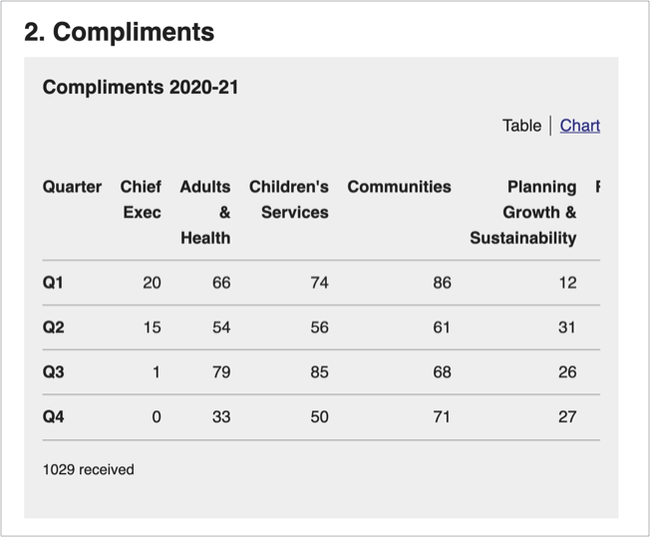
- tables
- pie charts
- horizontal bar charts
- vertical bar charts
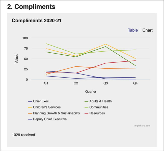
- line graphs
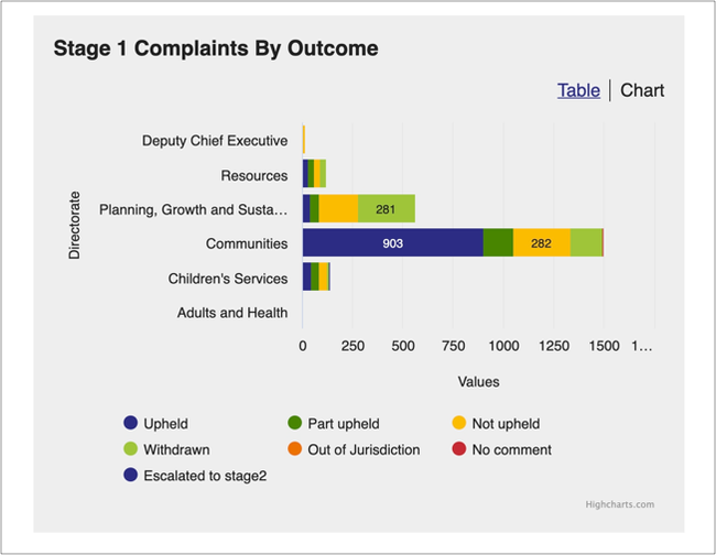
Example of a horizontal bar chart
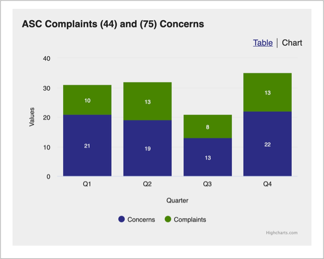
Example of a vertical bar chart
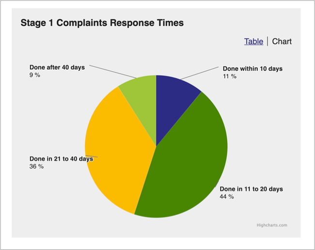
Example of a pie chart
Users are given the option to view data as a table or chart, using a toggle at the top right of each chart. This should help you present all of your data in a simple format.
You can't add infographics or other graphic elements to this template. If your infographics contain information that the user needs to know, make sure it is included in the body text.
Good practice when using tables
Only use tables as a way of presenting data. Do not use tables as a way of formatting text. Most screen readers used by visually impaired people struggle to read tables, which makes the information difficult to understand. Tables should be straightforward and uncluttered. If your table is complicated, present the information in a different way.
If you need to explain something about the information in your table, do this in the body copy.
Add columns to include extra detail. Try not to use more than 3 columns and keep the information in each column brief. If you need to add explanations or guidance, write these in the body copy rather than the table.
Converting policy content from PDF
This template helps you structure policy documents in way that makes it easier for people to access them online, whether on a phone, tablet or laptop. Compared with HTML content, information published in a PDF is harder to find, use and maintain. PDFs can often be bad for accessibility and may not comply with accessibility requirements.
Many of our policies are published as pdfs. If you are creating online content from an existing pdf, think about how you need to change the structure to make it work for online users. You need to do this because:
- PDFs are not designed for people to read online
- people read differently online
- PDFs don't always work well with assistive technologies like screen readers, magnifiers or changes to browser settings
Find out why Government Digital Service prefers HTML over PDF (GOV.UK)
Read our guidance on working with PDFs
Naming your page
Picking the right name for your document means your users can:
- find it more easily
- understand what it is and whether it’s relevant to them
The name you choose should:
- clearly describe the policy or strategy issue the document is addressing
- not be focused on branding or marketing
Example title
Title: Ensuring that vulnerable children are allocated a school place (Fair Access Protocol)
In this example, users might not know that the policy is called the Fair Access Protocol. Your research might tell you that they type ‘vulnerable children school’ into the search bar. Make sure that users will find the policy using their preferred search terms.
Help and support
Contact the webteam via ServiceNow if you need to:
- ask a question
- get help with writing content
- make a suggestion for something we need to include in this guidance
You can find more guidance on writing content in the content design resources in the GOV.UK Service Manual.