How to use the information template and contents panel
Information page template
When to use this template
Information pages are useful when many users have a similar need, such as finding out about:
- council services
- dates and fees for using services or making applications to the council
- changes to council services (such as seasonal bin collections)
- where to get support (such as getting help with food, bills and finances)
- legal guidance about a specific topic (such as parental disputes over school admissions)
You can use this template to give users information:
- to start a service, where the page links to a form (such as applying for a private operator licence)
- where they do not need to complete a specific task
Example
When not to use this template
This page may not be suitable when:
- you want users to complete a series of tasks
- you are sharing a council policy or strategy
- you are sharing multiple sections of guidance about a single process, such as moving up to secondary school
Browse our other templates
How it works
This is a basic template where you can structure content using headings, body copy and smaller components such as:
- postcode lookup
- tables
- accordions
- detail bars
- buttons (such as a 'start' button to link to a form)


This template doesn’t use an index. If you need to split your content into indexed sections, consider:
You can link to other pages from an information page using inline links, a bulleted list or the 'related pages' box to the right of the page.
Using a contents panel
A contents panel is a component which adds a grey box at the top of your page, under the title. It creates a content list from the headings in your page. A user can click on a heading in the contents panel to navigate straight to a section within the page (an anchor link).
All of the content under each heading is contained on one page - unlike the inline index, where each heading links to a new page.
A contents panel can be useful if you:
- have more than 3 headings in one page
- where some users may want to skip to the information or task that is relevant to them (for example, where you have different options for people in different circumstances)
- are sharing several pieces of guidance about a process
- have long sections of text under each H2 heading that can't be easily broken up into subheadings
Make sure your headings are clear and explain what each section is about. Headings should make sense on their own regardless of context, as they can appear in search results.

Example of the contents panel
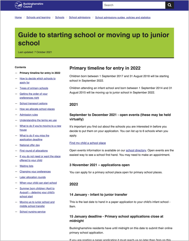
When to use the long form template
If you have a lot of headings in your contents list, consider using the long form template.
Contents lists can appear differently on different devices, browsers or when people are using assistive technology. While there are no rules on the number of headings you can use in a contents panel, think about how it will appear to your users. It might be hard for users to scroll back up from the body copy to the contents panel if:
- your contents list is very long (it disappears off their browser window)
- your body copy is very long (users have to scroll through a lot of text to get back to the contents panel)
The long form template presents your headings in a sidebar. Each heading opens a new page alongside your list of headings, rather than keeping all of your content on one page.

Help and support
Contact the Web Team if you need to:
- ask a question
- get help with writing content
- get help choosing a content template
- make a suggestion for something we need to include in this guidance
You can find more guidance on writing content in the content design resources in the GOV.UK Service Manual.