How to use the long form template for guidance or information
Long form content template (guidance)
When to use this template
Use this template:
- to address multiple user needs relating to one topic
- when users need to read a long list of information or guidance before completing a task or series of tasks
- where there are several guides relating to one topic that users may need at different stages of their journey (such as at the beginning, middle and end of the school application process)
We've created separate guidance on how to use the long form template for publishing policy, strategy or terms and conditions. Always use the words 'Policy', 'Strategy' or 'Guidance' in the page title to help users understand what they are reading.
Example
When not to use this template
This page may not be suitable when:
- you want users to complete a single task
- to complete a series of tasks in a specific order
- you are addressing a single user need
- your content is not all related to the same service area
How it works
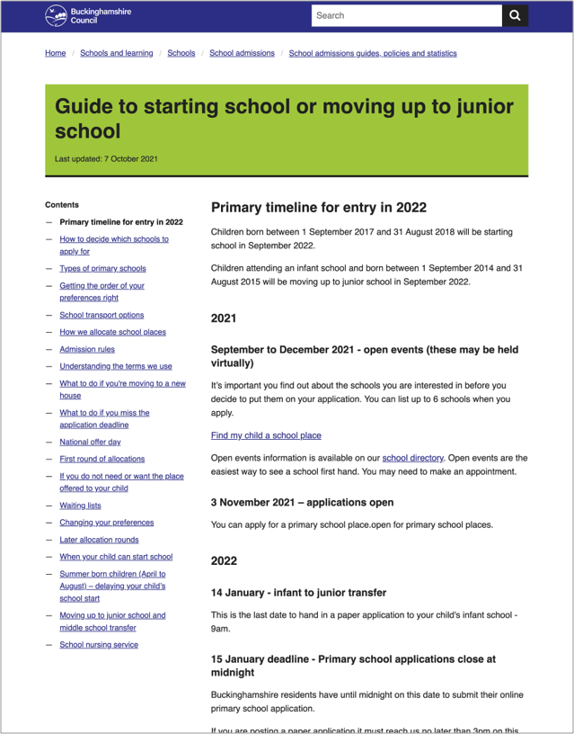
This template uses side bar navigation to help users find the information they need. Break up your content into sections. This navigation might follow a chronological order, such as:
- Primary timeline for entry
- How to decide which school to apply for
- National offer day
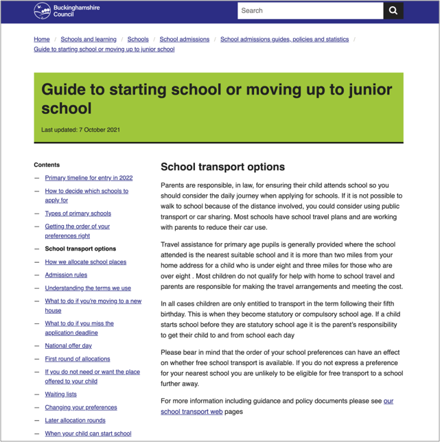
It could also include sections that might happen at different times for different users, depending on their circumstances:
- School transport options
- What to do if you’re moving house
- School nursing service

Each section header will bring up a new page. The sidebar navigation appears on the left of every page so that users can navigate between different sections or miss them out altogether.

Structuring your content
Your content should reflect user needs you’ve identified through research.
Start by mapping out your user journey. Think about what information users need at each step of their journey. Look at different types of users to check whether they need extra information. Use this journey map to start building your navigation in a way that will make sense to users.
Buttons at the bottom of the page help users navigate back and forth through the content in the order you’ve set out. They can also choose to navigate using the sidebar menu. This is helpful when:
- users need to read a lot of information
- users come back to the page several times at different stages in their journey

Titles and headings
Page titles and headings can appear in a list of search results. They should make sense regardless of where the user sees them. For example, "Guide" does not say much but "Guide to starting primary school" does.
Make sure your titles are clear and describe what the page about. This will:
- help users find the page
- help users decide if the information is relevant to them
Use active words that describe the task. Avoid unnecessary introductory words.
Example titles
Good example: Guide to moving up to secondary school
Bad example: Information and guidance for parents when your child is moving up to secondary school
Help and support
Contact the Web Team if you need to:
- ask a question
- get help to choose a template
- get help with writing content
- make a suggestion for something we need to include in this guidance
You can find more guidance on writing content in the content design resources in the GOV.UK Service Manual.