Working with PDFs
Like many councils, we often use PDFs when publishing policies, strategies or long information documents.
In most cases, we prefer to publish content online (in HTML) rather than in PDF.
In many cases we have to convert PDF content into HTML so that people can read it online. This page contains some hints and tips to help you make your document accessible.
Watch an in-depth training video about accessible PDFs
Silktide have created an in-depth video training guide about making accessible PDFs. It also covers fixing PDFs that are not accessible.
A digital first approach
We prefer to draft content for publication in HTML first. This is because PDFs:
- do not change size to fit the browser; users need to zoom in and out or scroll vertically and horizontally
- are not designed for reading on screens; people read differently online so content that is designed to be read offline can be hard to read
- do not tell us much about who reads them; with HTML content, we can track how users are interacting with content and make improvements
- can take the user away from the browser when they open so it's hard for users to navigate back to the website
- are not always formatted in an accessible way and don't meet accessibility standards
- are not useful for users who need to change browser settings (such as colours or text size) to make online content easier to read
- are hard to keep up to date; users might download a pdf and check it offline, so they might miss the latest information or updated links on the website
Some user needs may be better met with printed documents or downloadable PDFs. This page offers guidance rather than a set of rules.
In most cases, a digital first approach will help you create content in a way that helps users find, read and understand information in the way that is most accessible to them.
When you need to send a PDF or another document to us to be converted into a webpage, we would need to receive the final version of the document. Any changes that need to be made after the webpage has been drafted would need to be made based on the new, adapted web page content.
This guidance is adapted from a GOV.UK blog about using HTML over PDF.
Creating accessible content from PDFs
There are a few things you can do to make your content more accessible. When drafting in Word, Adobe or other document software, these tips can:
- make your document more accessible
- make it easier for a content designer to convert your document to HTML
Use headings to structure your content
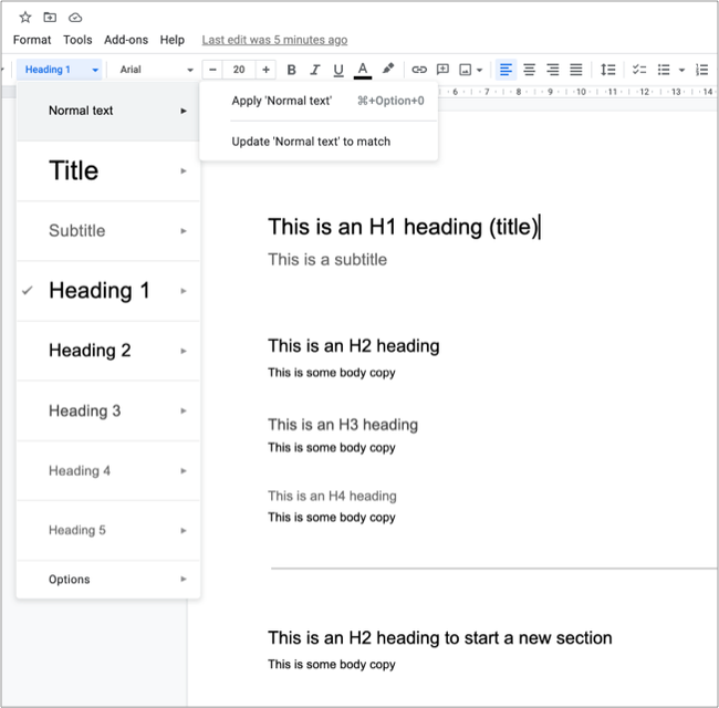
Titles and headings are a simple way to make your content easier to read. Screen readers recognise heading levels (or 'tags') to create a list of contents for the user. If the heading is not tagged, the screen reader will not identify it as a header.
Use heading tags from H1 (for a page title) to H4 to break up your copy in a way that will help the user. Your headings should follow a logical order and help to group content together. Don't skip a heading level, for example from H2 to H4. This can be confusing for people using screen readers.
Always use heading tags rather than bold text or increased font size. A screen reader will not identify bold or larger text as a heading.

Using the heading tags menu in Google Docs
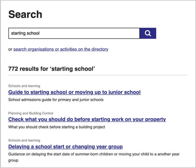
Page titles and headings can appear in a list of search results. They should make sense regardless of where the user sees them. For example, 'Guide' does not say much but 'Guide to starting primary school' does.
Make sure your titles are clear and describe what the page about. This will:
- help users find the page
- help users decide if the information is relevant to them
Use active words that describe the task. Avoid unnecessary introductory words.

Add alt-text to images, diagrams or maps
You should only use images or diagrams if they:
- provide context for the information
- help users understand information in a different way
If you decide to use an image or diagram, keep it simple. They need to be clear and easy to understand.
Avoid using images or text boxes to 'break up' text. Use clear headings and a sensible structure to help users navigate long sections of text.
Not all users can view images. Your images should support the text rather than explain the text. Make sure that anything you want the user to read is in the body text, not in an image. Screen readers will not read text that is contained within an image.
Always describe images for people who can't see them using alt text or a caption. All images, except decorative images, must have alt text that:
- tells people what information the image provides
- describes the content and function of the image
- is specific, meaningful and concise
If you are including a map to show a location, make sure that the location is also described in your body text or alt-text.
Use accessibility checkers carefully
Most word processing applications (such as Microsoft Word or Adobe) include an accessibility checker. These can help to:
- check that you've included headings in tables
- check you've included alt-text
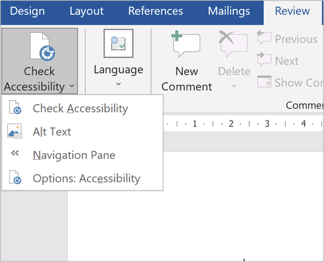
Accessibility checkers vary between different applications - they don't all check for the same things. You should always follow good practice to make your documents accessible and use the checker as a guide only. You can find the Microsoft Word accessibility checker in the 'Review' menu.
The accessibility checker in Microsoft Word will not flag up a lack of headings as an issue.

You can find the accessibility checker under the Review tab in Microsoft Word
Using tables
Tables are often used to display or format information in PDFs. However, tables can be hard to read online. Most screen readers used by visually impaired people struggle to read tables, which makes the information difficult to understand. Tables should be straightforward and uncluttered. If your table is complicated, present the information in a different way.
Only use tables to present data
We only use tables online as a way of presenting data. We don't use tables as a way of formatting text. If you need to explain something about the data in your table, do this in the body copy.
Add columns to include extra detail. Try not to use more than 3 columns and keep the information in each column brief. If you need to add explanations or guidance, write these in the body copy rather than the table.
If your document contains a table, we may need to reformat the text to make it easier for people to read online. Before you use a table, think about whether you could present your information without a table using clear headings and structure.
We have created content patterns to help you format certain types of information in a way that is easier for users to read.
Make sure your table is accessible
We see two common issues when converting tables from PDF to HTML:
- missing headings
- merged cells
Always add headings to your table. Bold text is not tagged as a heading for screen readers.
In Microsoft Word, open the 'table design' tab then check the box beside 'header row'. This will make the first row into a header.
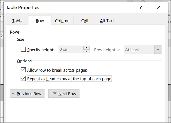
If your table stretches across more than one page, you can repeat the header on each page. Right click in the header row, choose 'table properties' then 'row' then check 'repeat as header row at the top of each page.'

Add a repeated header under Table Properties in Microsoft Word
When you merge cells in a table, it can make it harder for people to read. Don't use merged cells to create a blank row or to stretch headings across more than one column. Merged cells and blank rows can make it hard for people using assistive technology to identify table headers or different sections within the table. Often, you can avoid the need for merged cells by breaking your table up into multiple, more simple tables.

An example of a table using merged cells

How to create the same table without merged cells
Help and support
Contact the webteam via ServiceNow if you need to:
- choosing a content template
- structuring your content
- making your content accessible
- displaying complex information in a way that is helpful to users